NEW YORK COSTUMES: Site Prototyping
OVERVIEW // CONTEXT // USER RESEARCH // CONCEPTING // SCENARIO // WIREFRAMING // CONCLUSIONS


Project Overview
In this User Experience class project, we were assigned both a client (New York Costumes) and a sampling of personas to re-design the skeleton of an existing online shopping experience. Our main focus was to apply lessons in information architecture, content strategy & heuristics analysis to the following processes:
- Card Sorting & User Interviews
- Site Map & User Flow Analysis
- Journey Mapping & Medium-Fidelity Wireframing
- Prototype Building & Usability Testing
- Assessing Business Goals & Presentation
During the course of this project, the following tools were used: Omnigraffle, Sketch, Invision, Adobe Illustrator, Keynote & TRUE GRIT.
Context & Information Gathering
To get a better sense of the overall marketplace for online costume shopping, I reviewed the larger-in-scale competitive sites for Spirit Halloween, Buy Costumes & Party City. While these competitors are the Wal-Mart to NY Costumes' "Mom & Pop Shop," online shoppers unfortunately make no such distinction. Certain aspirational details worth noting from the competition include:
- Large, colorful product photography
- Discrete, distinctive categories
- Easily utilized shopping cart
When I turned my attention to New York Costumes however, the situation was less than ideal. I myself have been an avid shopper of the physical store for years. Upon my return to the store, I found it to be every bit as fun, quirky & chaotic as I'd remembered. And the website possesses these qualities too –in the sense of a scary artifact of Another Time Gone By.
To remove my clear bias, I solicited the opinions of several others (non classmates) to determine how badly New York Costumes was missing the mark. I asked them to spend 5-10 minutes trying to buy a costume for Halloween. And once they felt familiar with the site, I had them rate the site along a 1-5 scale (least to most) using Abby Covert's Heuristics:
As you can see, there's some room for improvement. I received some choice pull quotes (some of which not printable) but perhaps my favorite was simply: "Using this site was comparable to a visit to the DMV." Wow. The last time I myself visited the New York DMV, I left with my eyes full of salty rage tears.
Clearly there was a lot of work to do.
User Research
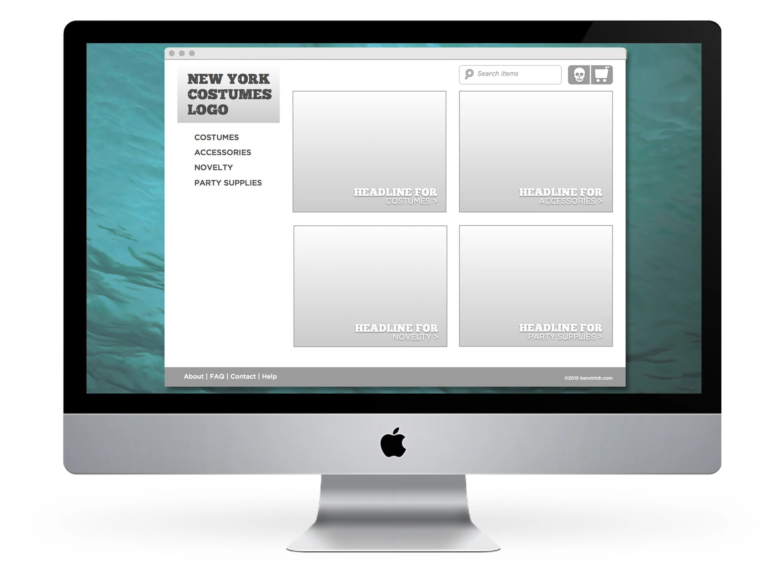
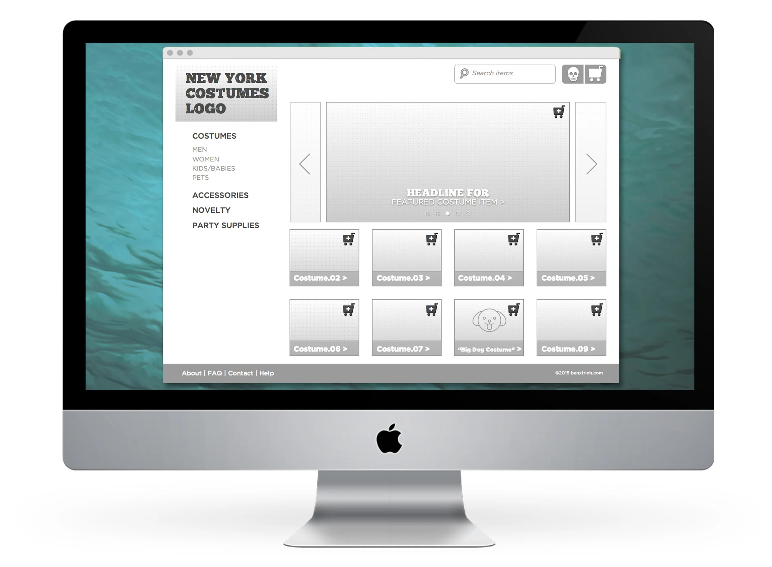
We kicked things off with users card sorting an array of 100 selected items from NY Costumes' vast inventory. In the current site, much of the confusion comes from equal weight given to over a dozen top-line categories. By contrast, the card sort most notably resulted in 4-5 categories. And the follow-up closed-card sort supported the choice of four top-linecategories: Costumes, Accessories, Party Supplies & Novelty.


Concept & Early Design Phase
With the first steps of my information architecture in place, I began sketching out ideas for the site map skeleton in Omnigraffle. To test my assumption that a Top-Down approach would in fact be more effective than a Broad & Shallow one, I pinned up both for an informal group review. And in fact, three out of four people chose the Top-Down Site Map model –while another person even complimented me on my hair.


Based on the above feedback, I made slight adjustments to my naming conventions and also kept in mind that I would need to add secondary navigation to my footer. More confident in my assumptions, I turned my attention to sketching out the skeleton for my user interface.
Those of us with overlapping clients got together to pool our knowledge in a loose Design Studio exercise. We shared our strongest ideas to best solve the problem of New York Costumes' site interface. Afterwards, we broke off on our own for a round of rapid sketching, quickly iterating the most basic shape forms that would address our content hierarchies more concretely.


This accelerated process proved to be immensely helpful. Having only 45 seconds for each drawing left no time for getting lost in the details or worrying about perfect lines. More importantly, swapping ideas with team members revealed a much stronger, more diversified list of takeaways:
- Dual points of global navigation: Visual & Verbal
- Prominent global Search functionality
- Secondary footer navigation
- Scrollable/sliding featured items Window
- Omnipresent breadcrumbs for location cues
Scenario & Journey Map
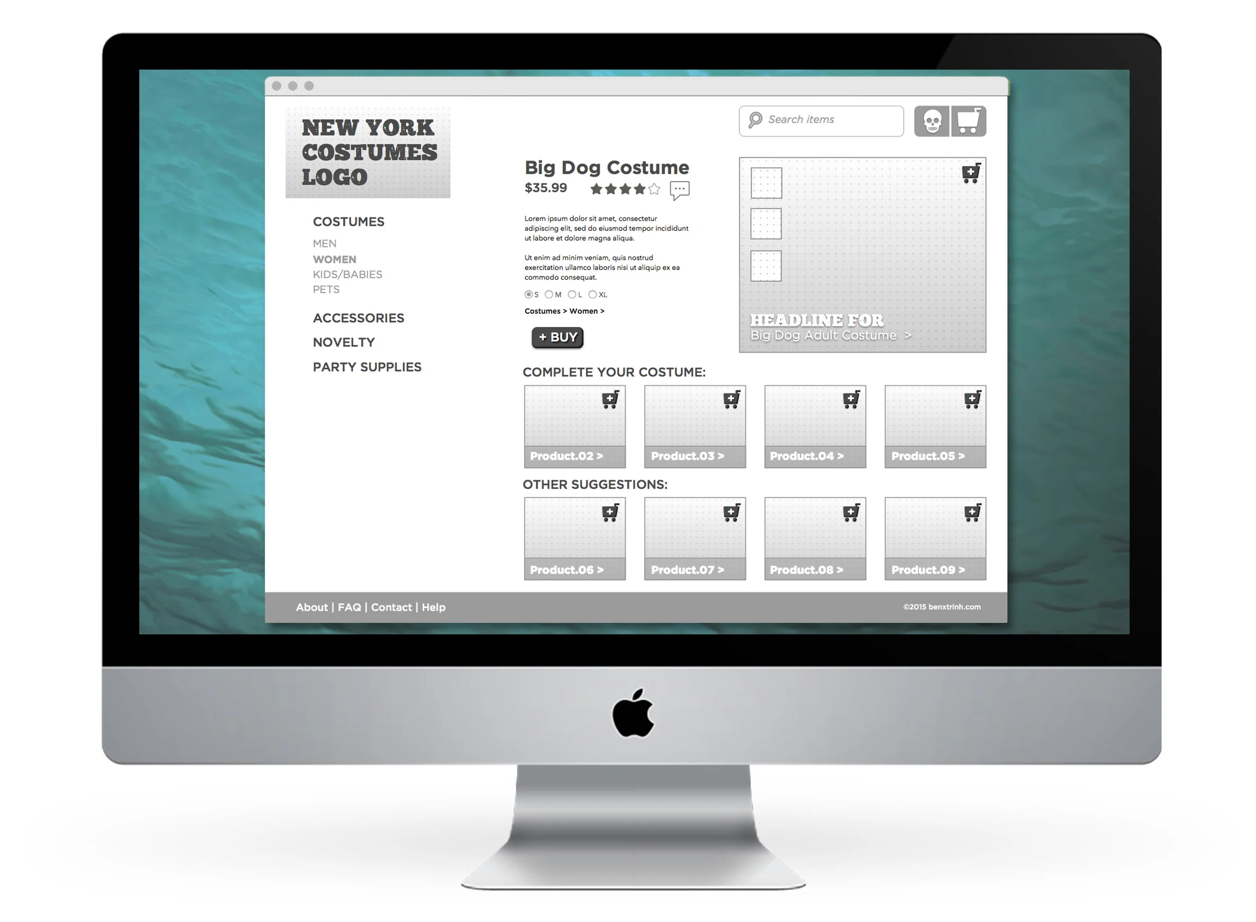
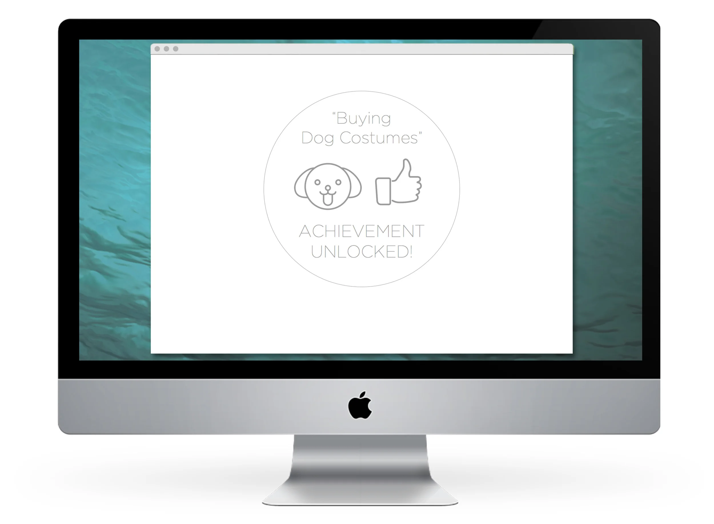
At this point, I was raring to barrel forward into bringing these sketches to digital life –but then I had to remember that I wasn't creating the sexy front-end for a full functioning website. I needed to scale down the number of screens from a full-blown site and circle back to the User Personas assigned to us in the assignment. And so I chose to construct a story scenario around the lovely Miss Edda –because we all love our grandmas.
I was so taken with how much that Edda here loves her grandson that I constructed a scenario in which she would buy costumes for them both to go trick-or-treating. They would both dress up as puppy dogs because Edda's grandson loves puppies. I had so clearly envisioned this cloyingly sweet image in my head that I may just have to illustrate it(!) one day –but those were issues for another time alas.
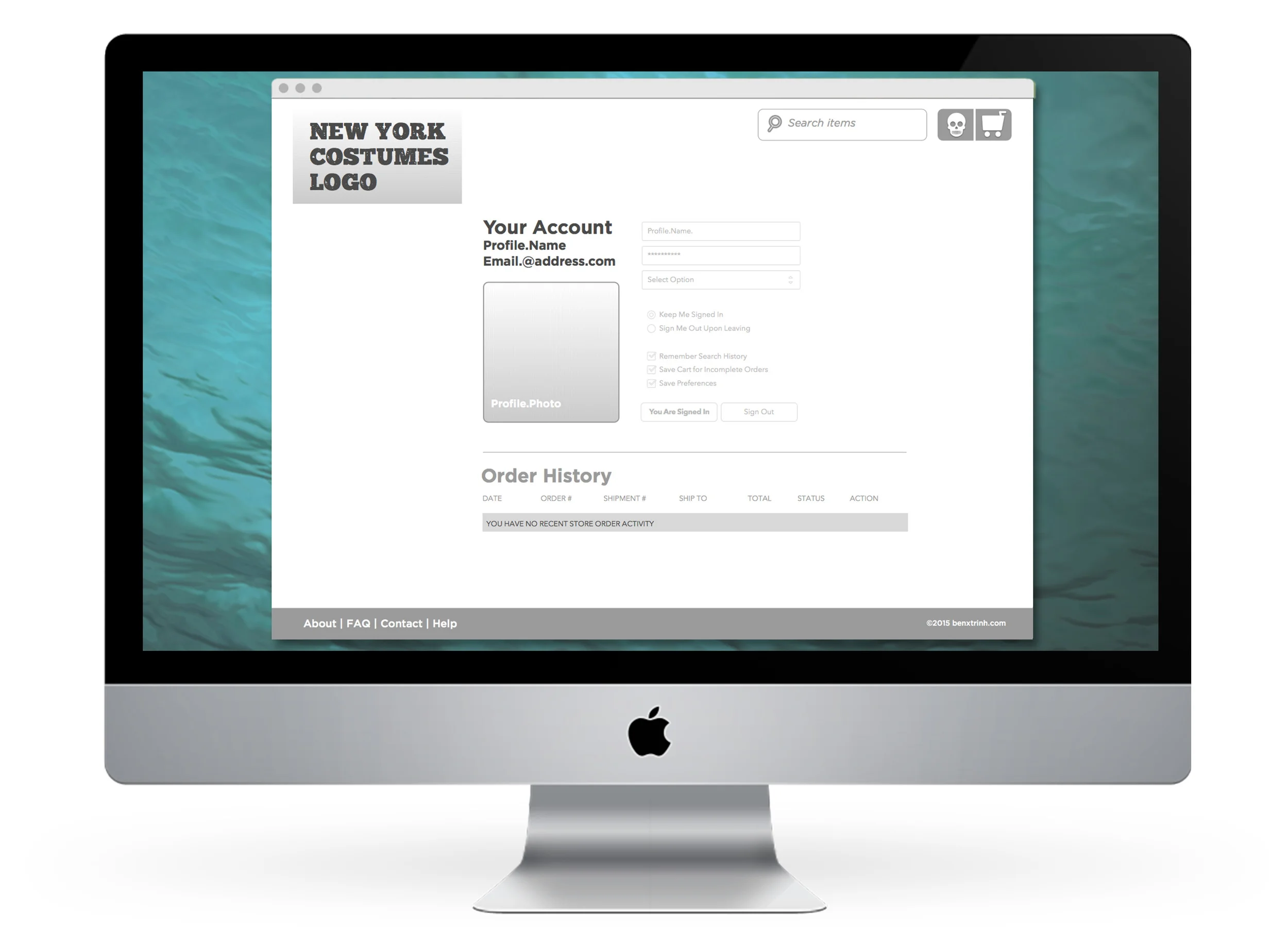
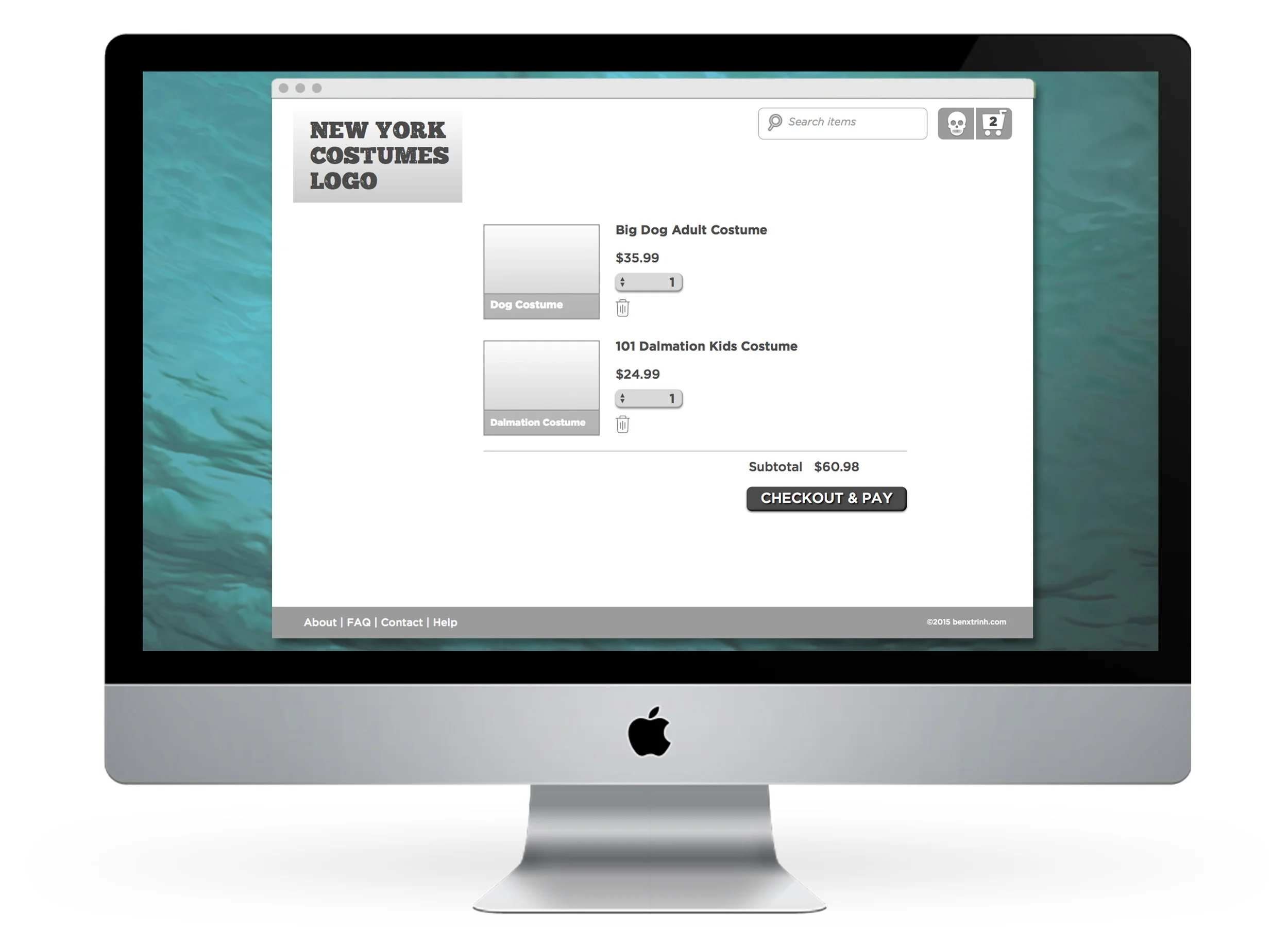
To complete her journey, Edda will need to use this new website to perform a series of tasks:
- Sign onto her New York Costumes account
- Navigate to the product page for her adult dog costume
- Add this item to her cart
- Search for her grandson's costume
- Add this item to her cart
- Navigate to the cart page to confirm her items before checking out


Based on this roadmap, I now knew that my Wireframing will require me to primarily focus on: Home, Section, Product & Cart screens. Go time!
Wireframing
The process of Wireframing began with moving my sketches into Sketch (the program). Once again, I had to remind myself that I was not designing the sexy front-end for a full functioning website. So I curbed my baser graphic design instincts and limited myself to black and white medium-fidelity –this wouldl keep me focused on navigation, hierarchies and flow.


The pinup of my first round wireframes went really well. A treasure trove of feedback awaited me at the end of a post-it rainbow and yet again I was indebted to my peers (now is a good time to mention –I'd be dooomed without my peers). Moving into my next phase to a working prototype, I incorporated this feedback:
- Reduce the font-size globally
- Left-Align the side bar's global navigation menu
- Ensure there is a rollover indicator that the "Skull" icon is in fact an account Log-in
- Left-Align Product Title & Descriptive copy
Turning my attention to Sketch and creating the implied functionality of my prototype, I was struck by an epiphany of relief: I am so glad that I mapped out an exact User Flow. The alternative of prototyping an entire's site of functionality without the guts of back-end coding would have been an absolute nightmare. The limited, implied functionality of my working prototype resulted in a grand total of 23 screens.
At long last, I had the screens for a working prototype fully Sketch'ed out!
Using Invision, I was able to create a very carefully constructed web of hot links that would give my prototype the seeming functionality for testing navigation and information architecture. Combined with the exact scenario that would mirror Edda's journey to Halloween, I was finally ready to begin Usability Testing. And this scenario was crucial –without it, the navigation would break at certain points because this was not a fully functional site.
Conclusions & Results
With one final round of new User Testing, I was able to gather some informal quantitative data about User's perceptions of my prototype. After each participant successfully completed the series of tasks, I gave them a few minutes to rate the experience using the same index of Abby Covert's Heuristics that we used to review the original website. And unanimously across the board, every single vector saw improvements. Most significantly, increases in perceived Usefulness, Controllability, Value and Delight were at the forefront of this measured success.
So that was it, this job was done.
Oh, wait. There were minor improvements made in certain areas for further clarification. And then there was the matter of a responsive mobile-based wireframe adaptation. And ultimately, if we were not stopping at this stage we would address the matter of a final visual design. In fact, the job is far from complete. The road to future development is fraught with many more interesting twists and turns.
As I presented this project and my findings, I was inspired by an unconventional choice to embody the metaphor of this website's evolution. This is a Costumes website and my presentation was a hypothetical performance for a client.
So I wore a mask.
The lessons learned on this assignment are impossible to count. From nose to tail, everything about this was a first-time discovery. More than anything, I learned to honor the process. In my past lives, I've been quite eager to rush to the end of things. Had I done so, I would have missed:
- the challenge of validating my assertions through research, iterating & testing
- the value of being enriched by thoughts and ideas from perspectives perpendicular to my own
- the relief of crafting a specific story and journey, instead of a sprawling machine of function
- the delight of taking a step back from being so immersed in a process and seeing how it all so wonderfully weaves together
Were I to have limitless time and resources, I would relish the opportunity to truly actualize this re-design.
From a business perspective, I think New York Costumes deserves a website that matches the verve and quirk of its physical store. To help drive more business year-round, I would introduce a seasonal microsite as well as a virtual tour of the historic space. Moving into mobile, I would want to repeat every step of the above process to ensure we take advantage of future shopping trends in that direction. And finally, the old graphic designer in me so desperately wants to perform a full branding surgical facelift to bring this vital business in line with modern tastes. But man, that alone would be a project as big as this one.
Hey, I'll be free come this September if you want to hire me.